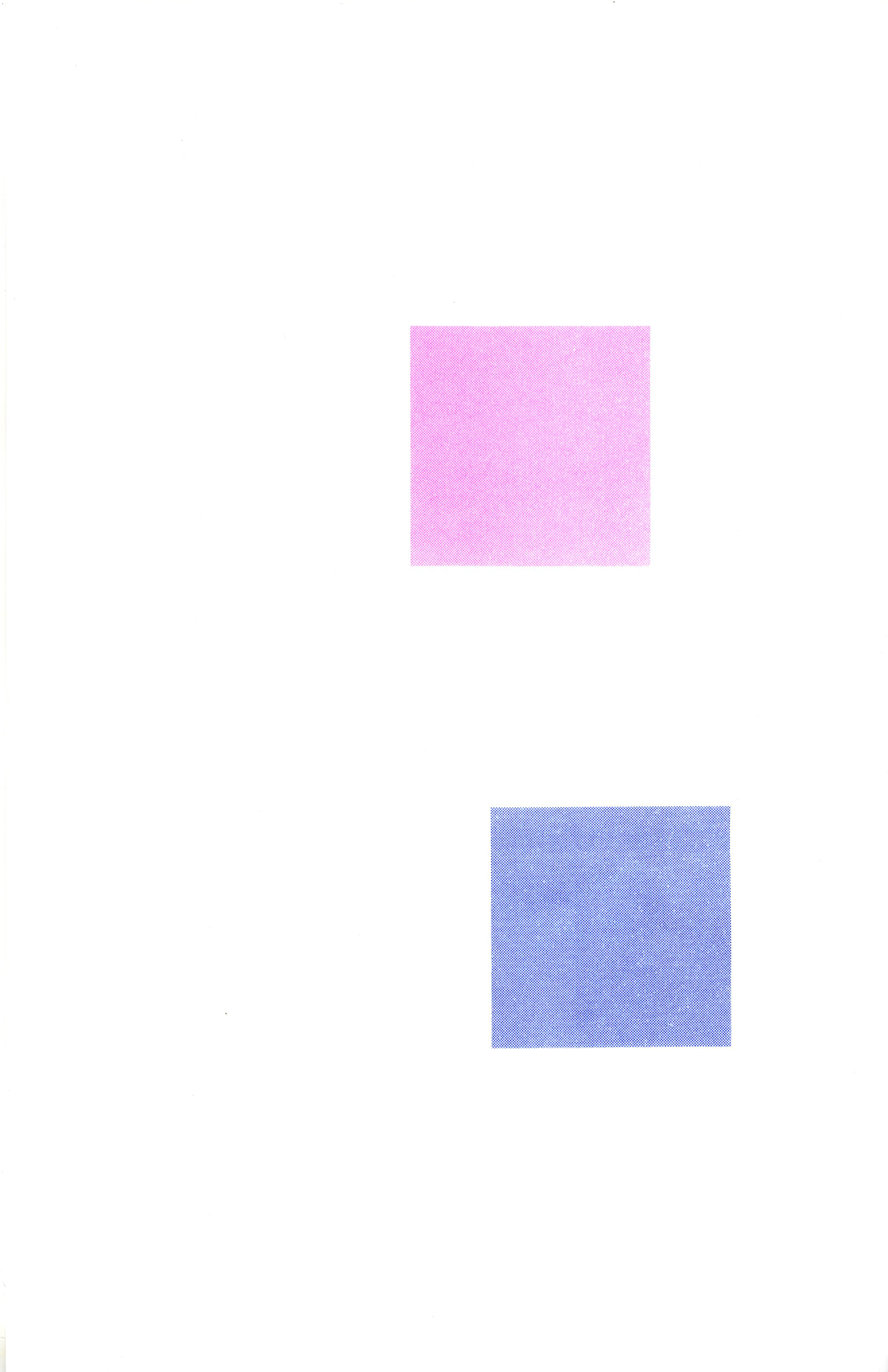
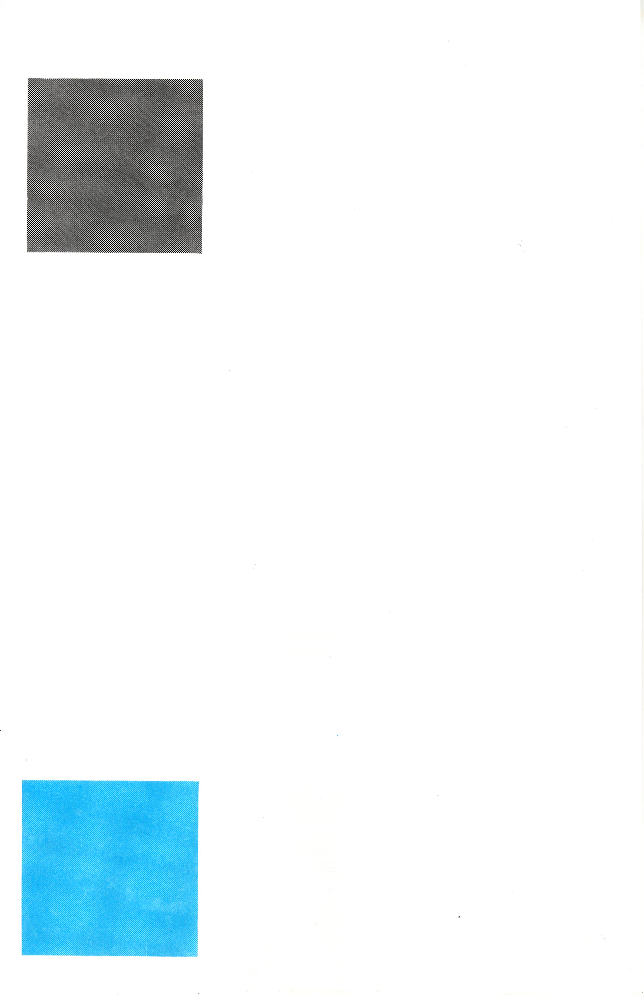
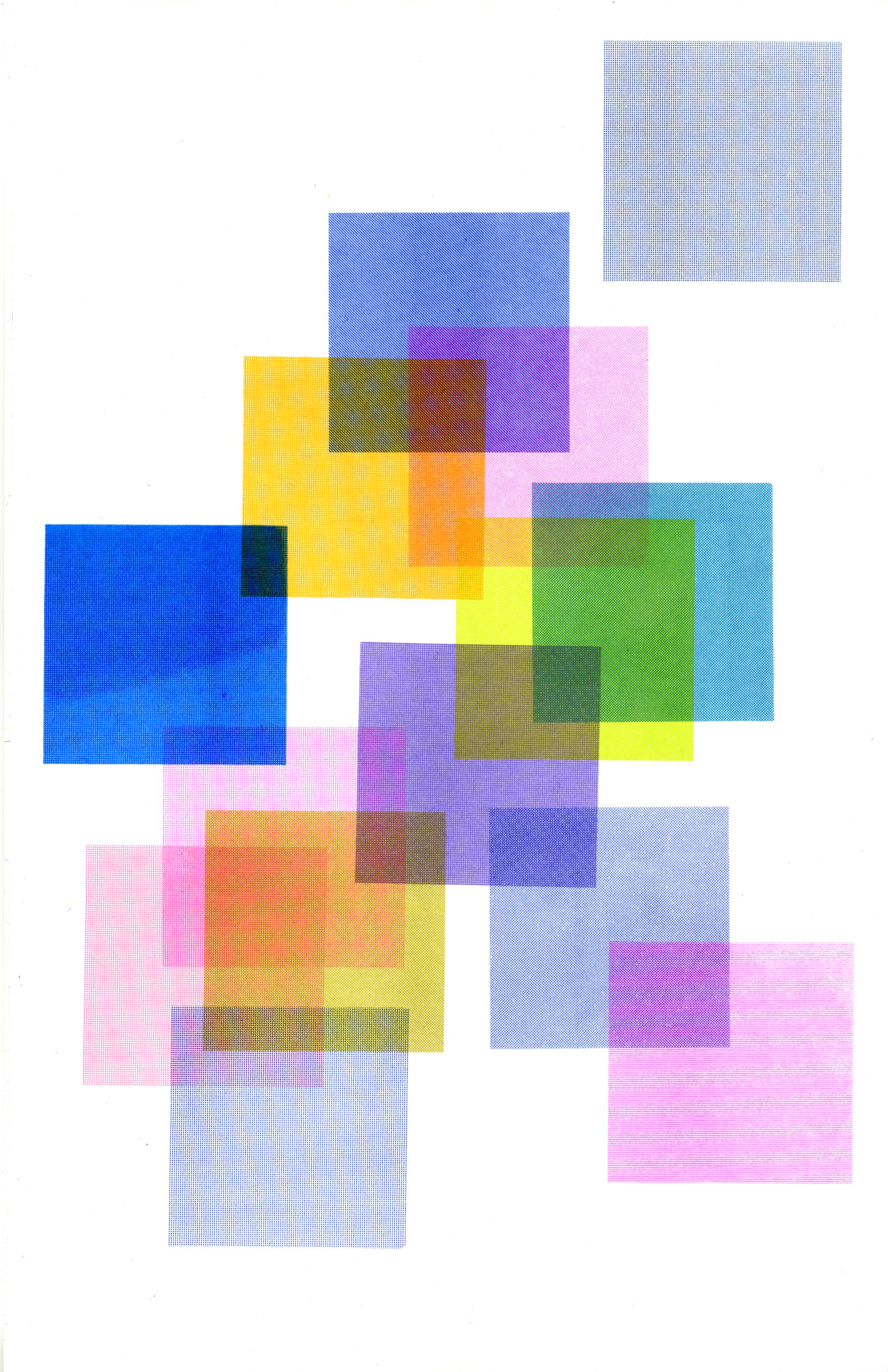
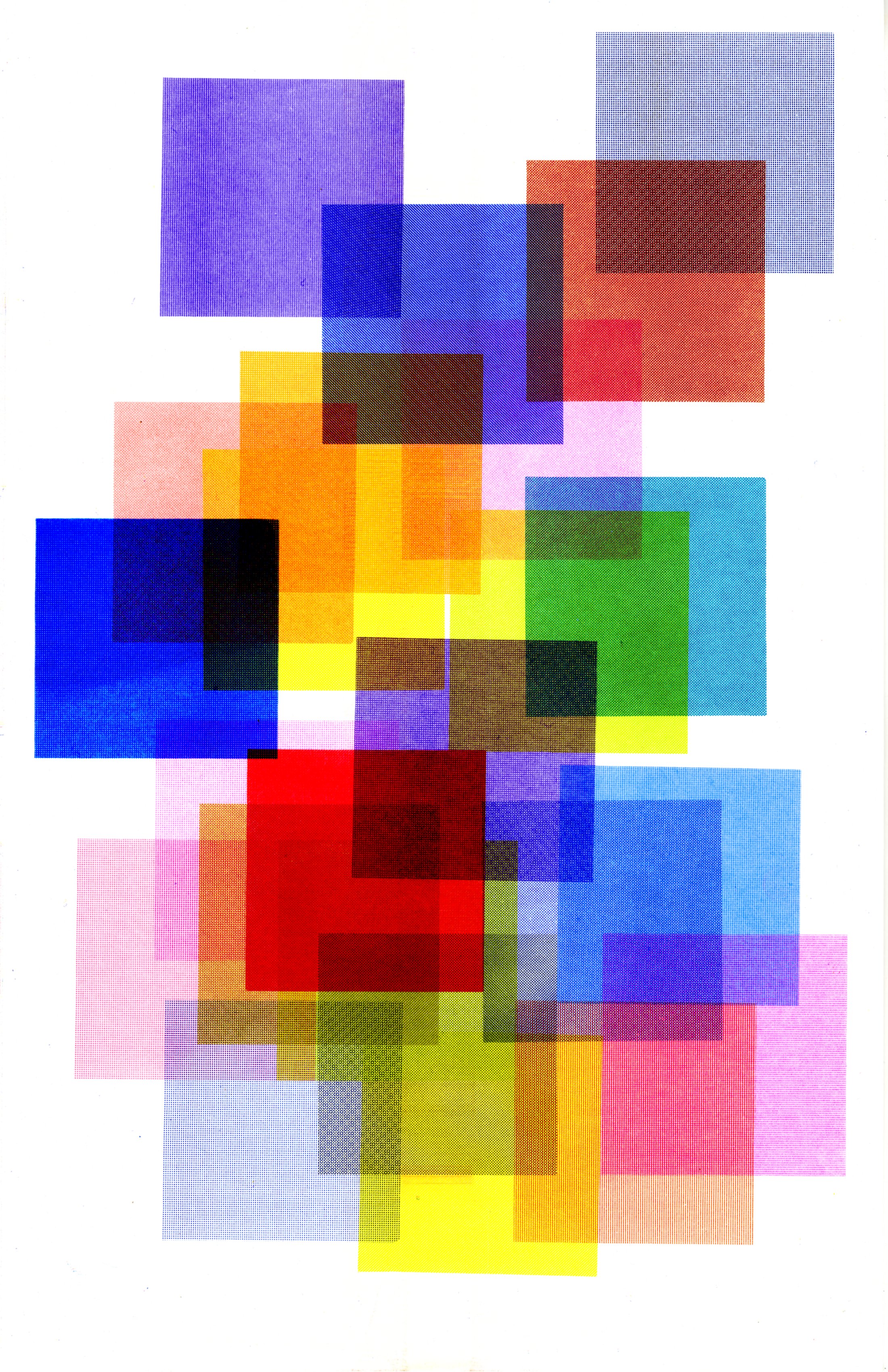
| 2/7 | 0 + 8 | Medium Blue + Fl Pink | |
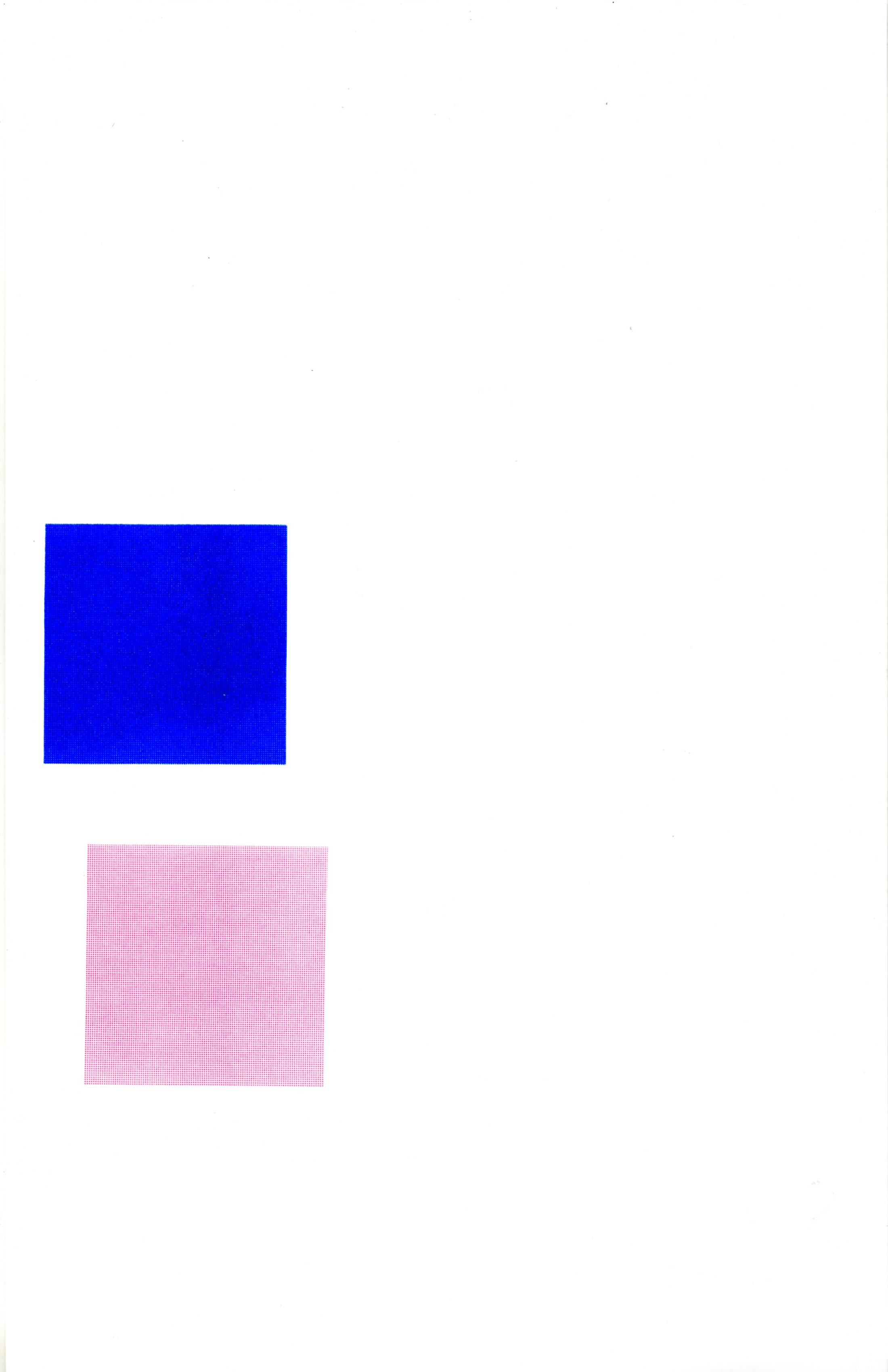
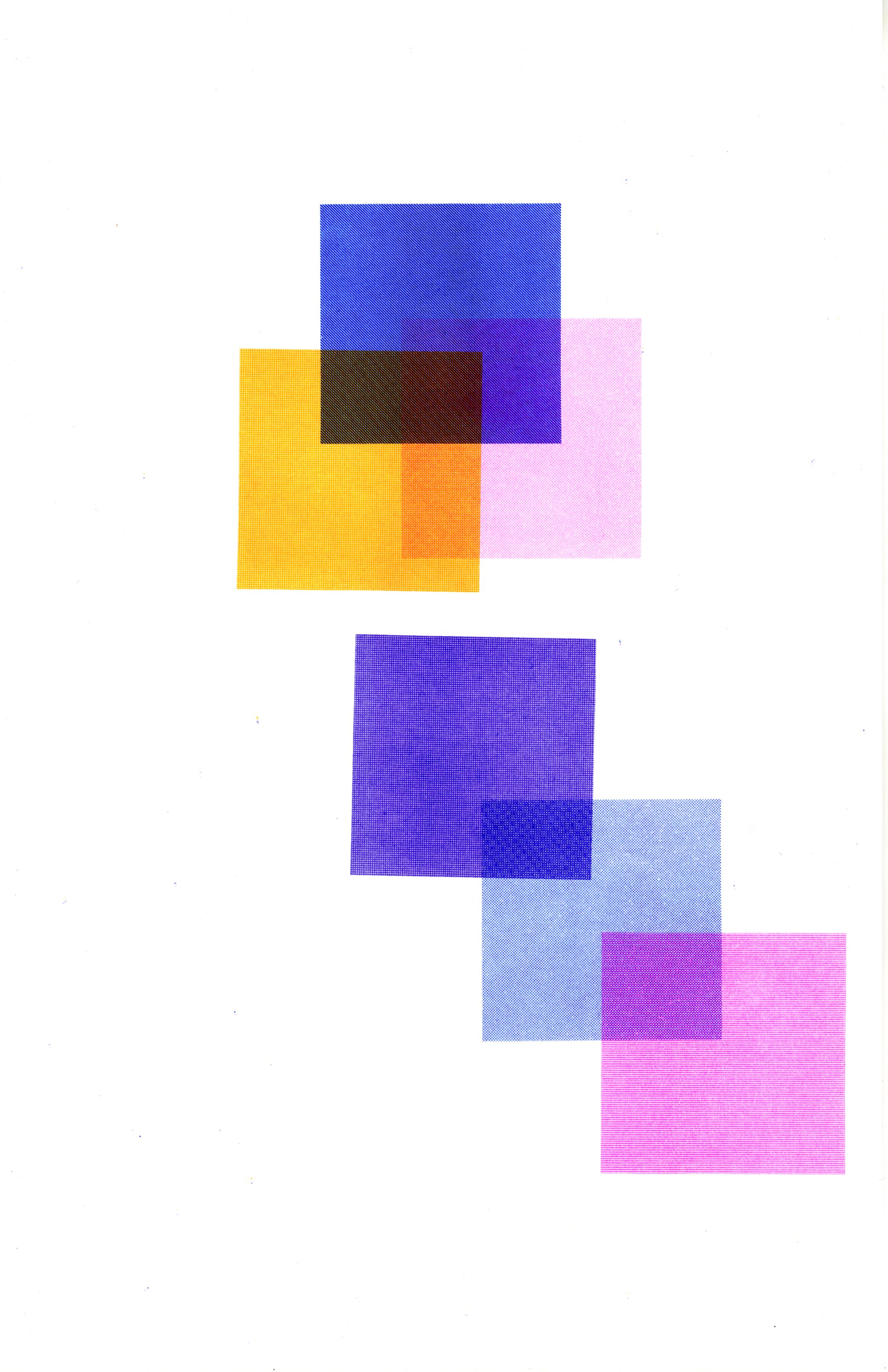
| 2/10 | 9 + 7 | Medium Blue + Fl Pink | I was concerned about the duplication of colors but different half tones and values made this very interesting |
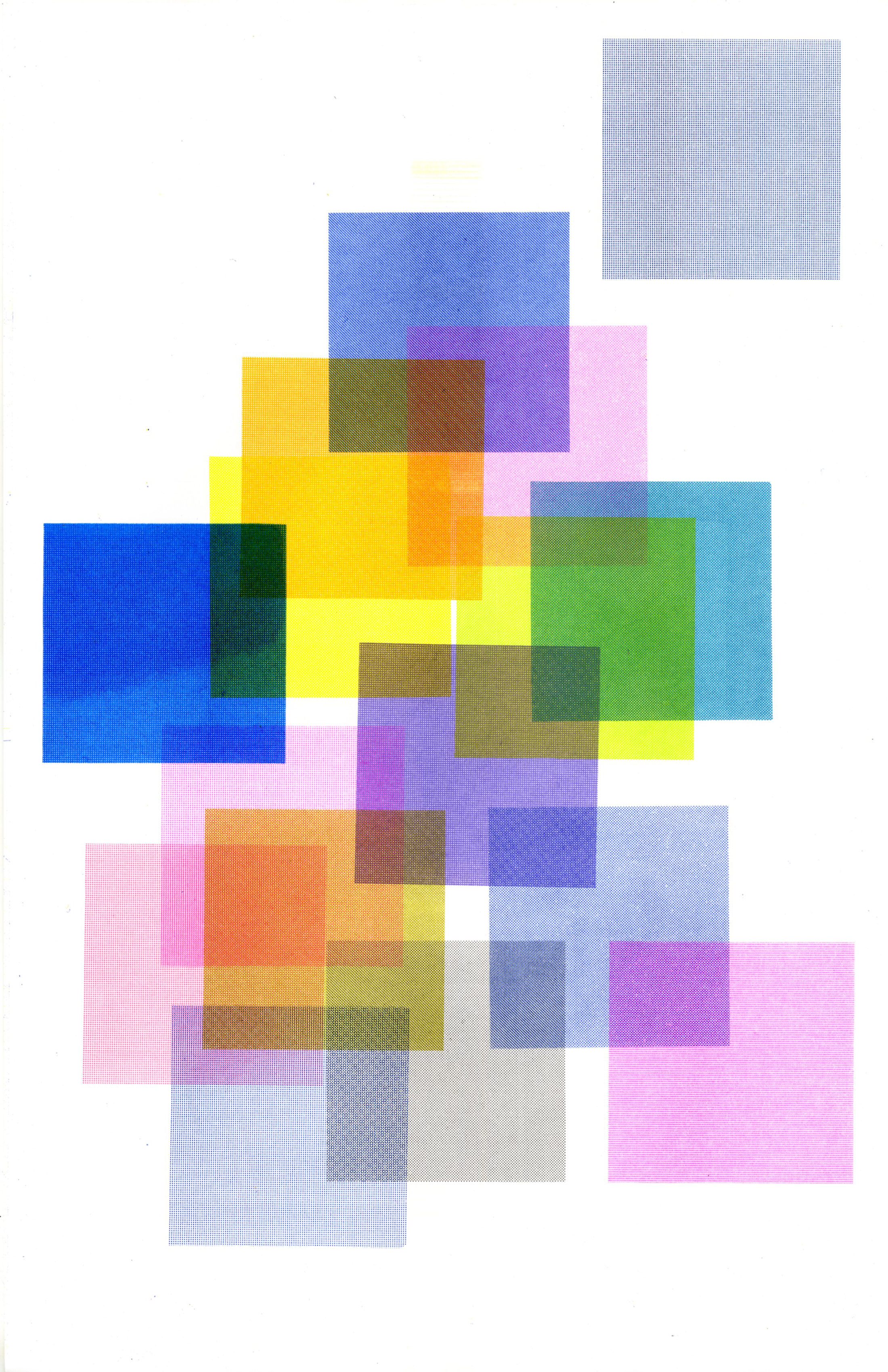
| 2/12 | 3 + 5 | Sunflower + Violet | Some moiré patterns are emerging especially where the violet is over the medium blue, but taking that as part of the process |
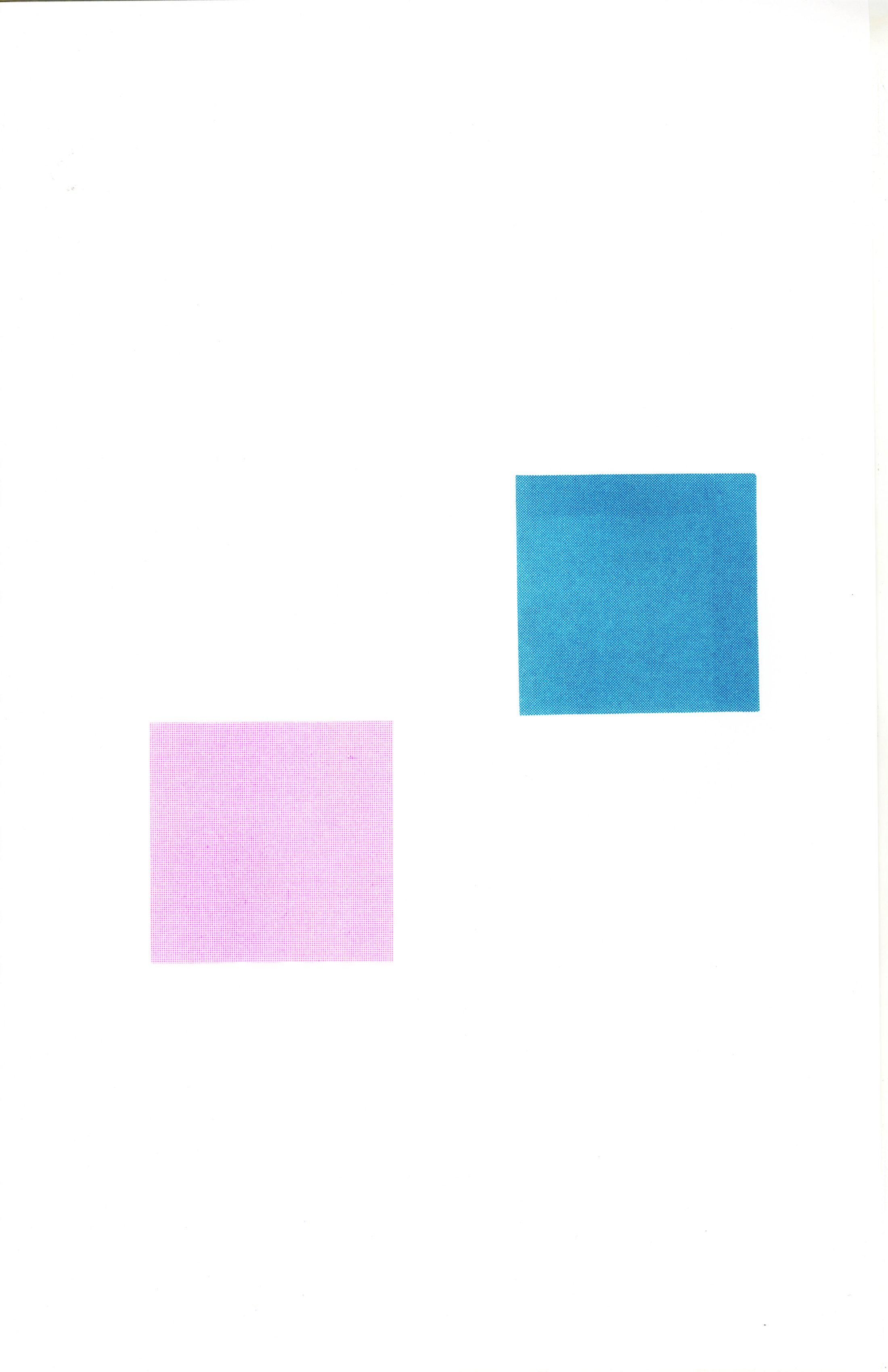
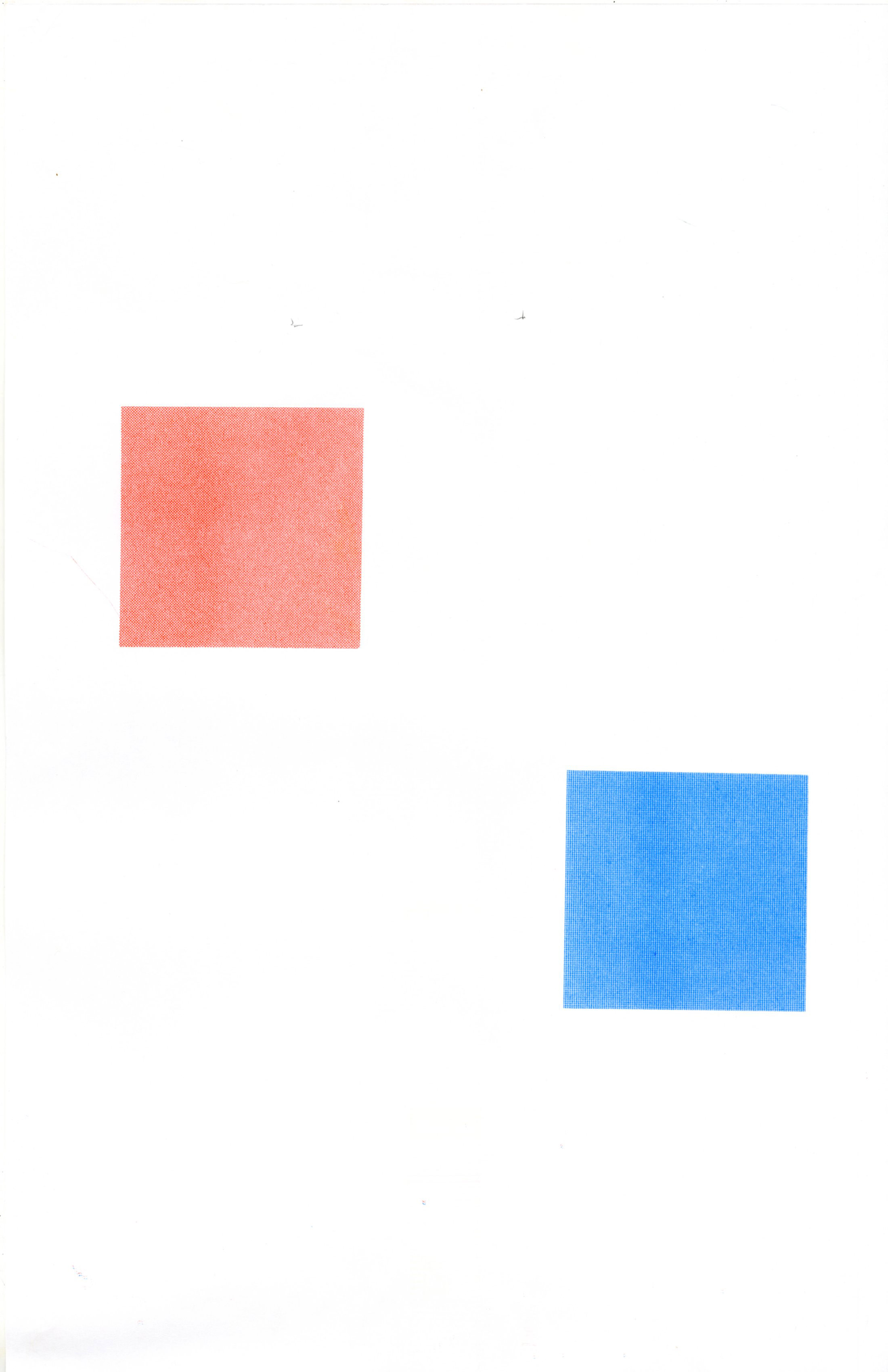
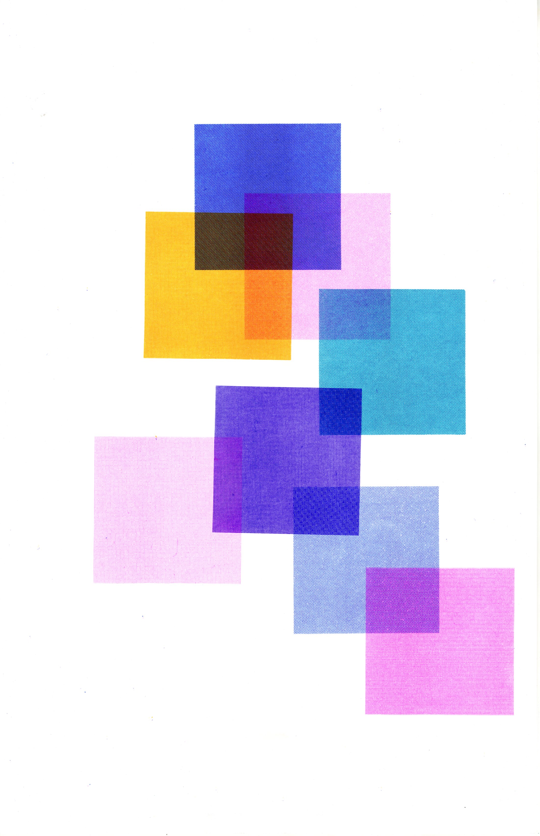
| 2/15 | 3 + 9 | FL Pink + Lt Teal | Fl Pink is definitely leading the pack in the Riso Lab. Lt Teal is fantastic with the blues and violet. |
| 2/16 | 2 + 2 | Bubblegum + Blue | More pinks and blues - this time Bubblegum and Blue. Not normally a fan of Bubblegum but seeing it printed on different colors is helping me to appreciate it. |
| 2/17 | 4 + 9 | Riso Federal Blue + Br Olive Green | 2 colors I don’t use a lot but at least we’ve broken the cycle of pink . Both of these are much calmer and richer - will tilt the palette. Embracing Moires. |
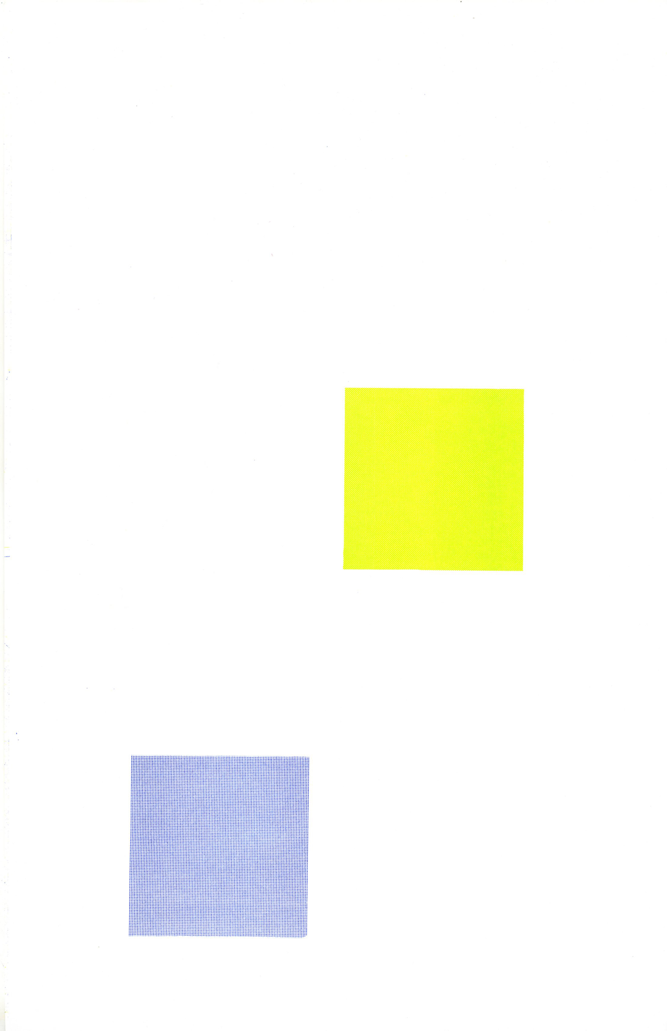
| 3/1 | 2 + 6 | Medium Blue + Lt Lime | So much medium blue. Also interesting that the past 2 session are a mirror in terms of color (Blue + a Greenish Yellow) and in placement, which wasn't intentional. |
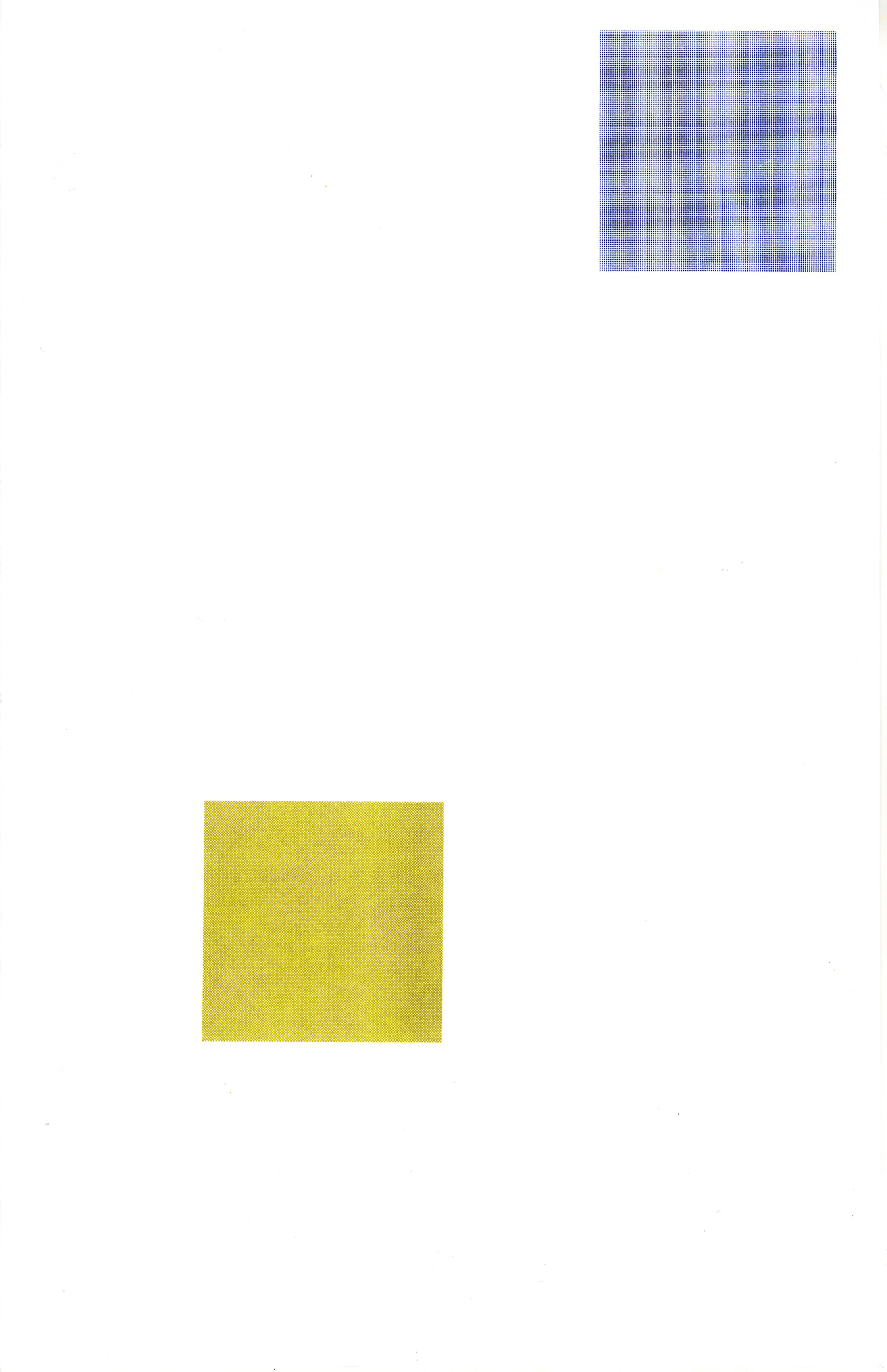
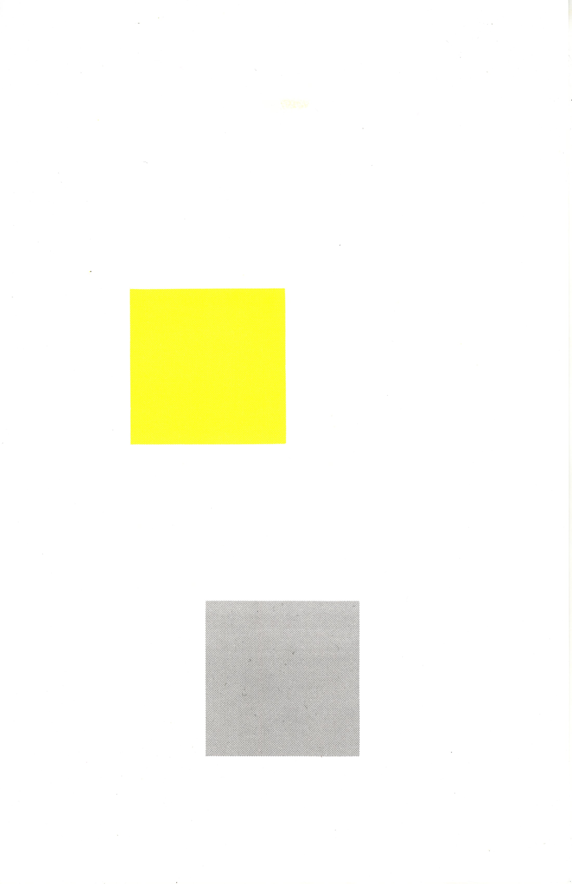
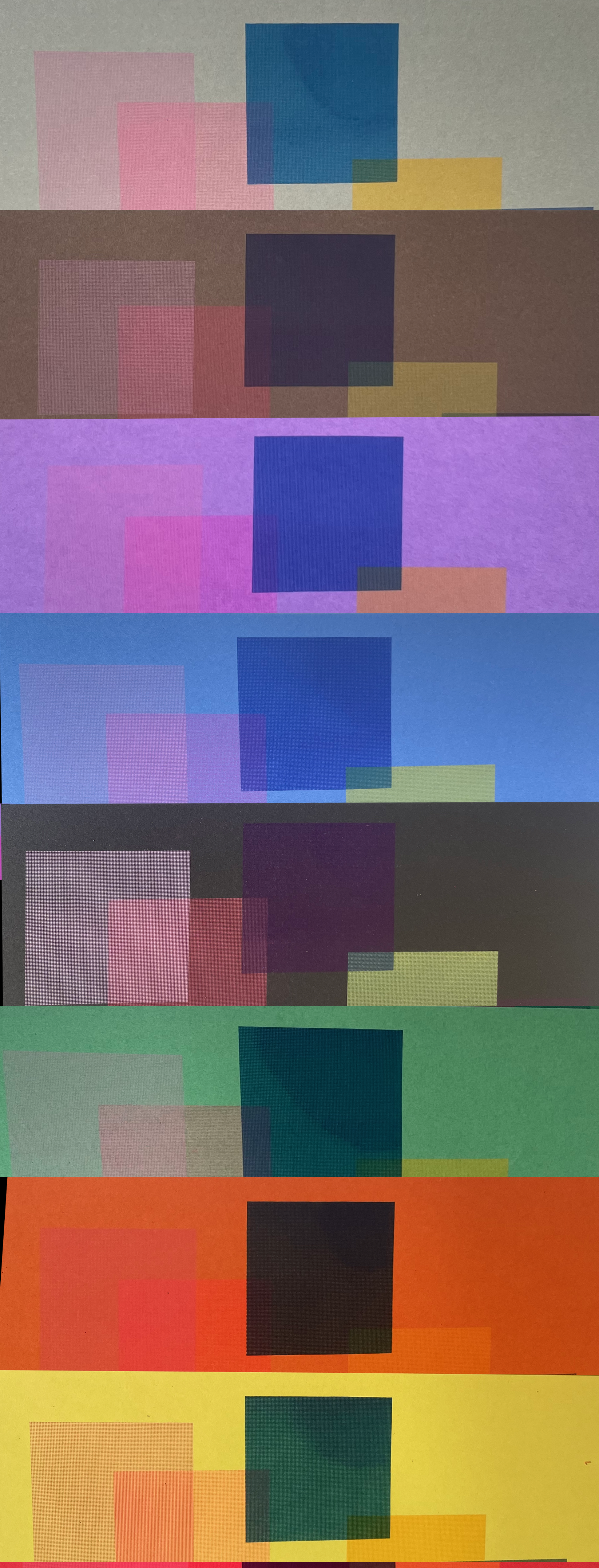
| 3/9 | 1 + 9 | Black + Yellow | Again, feel like I'm repeating placements with a darker (black) and lighter (yellow) |
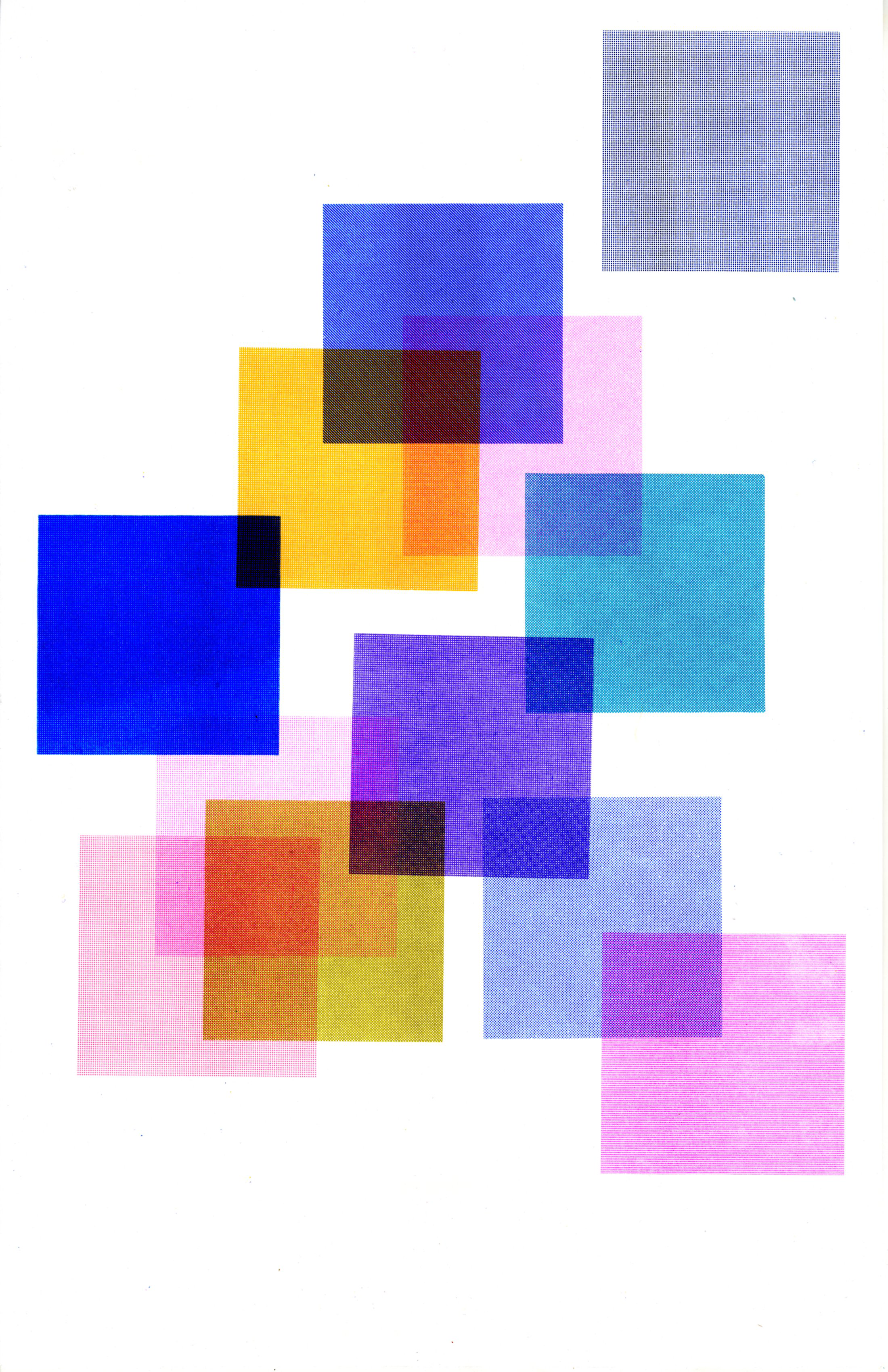
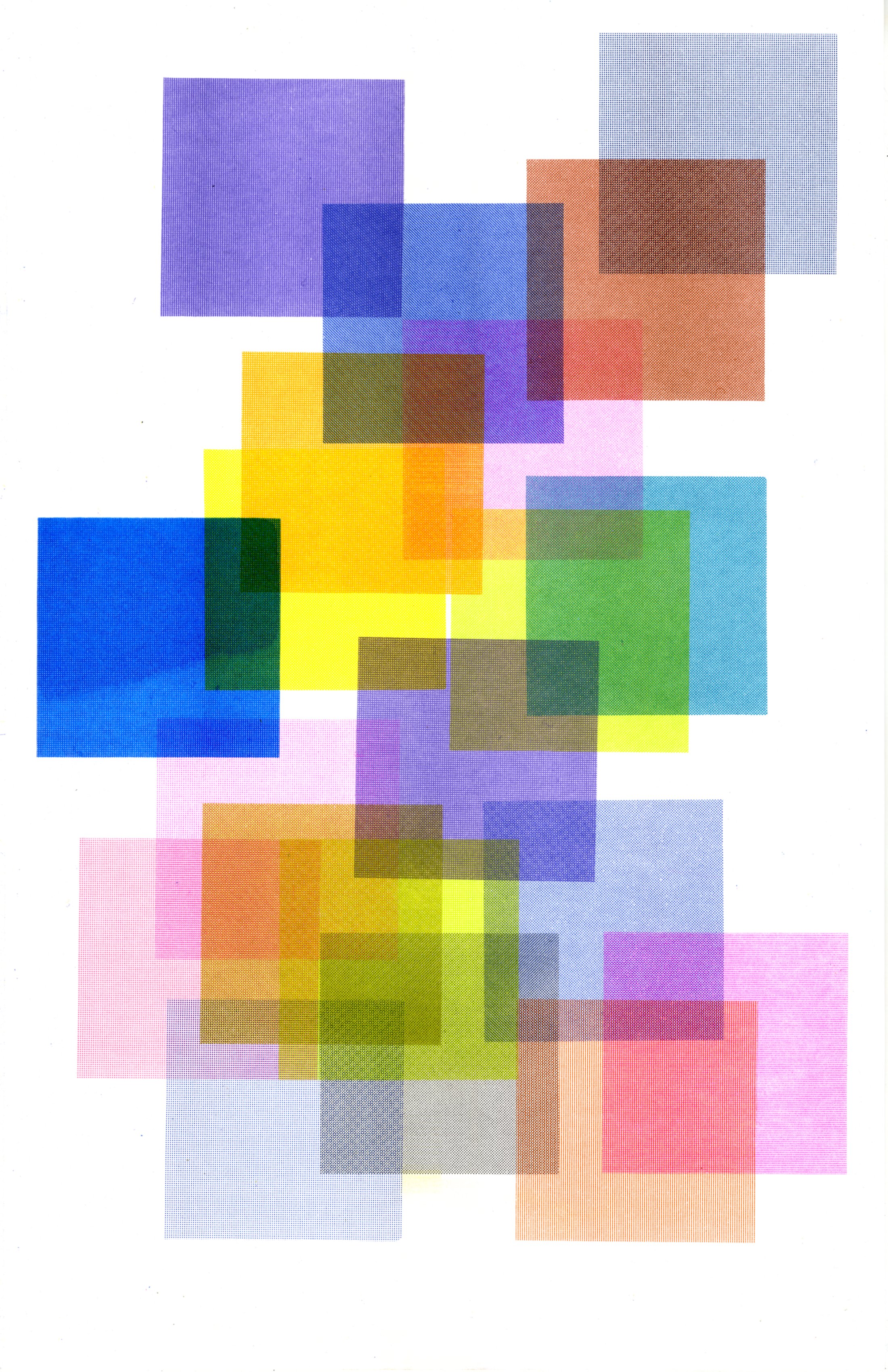
| 3/28 | 6 + 8 | Copper + Orange | This one was hard as I'm starting to think about how to resolve/balance for the final colors. Orange and Copper were a surprise - both beautiful. |
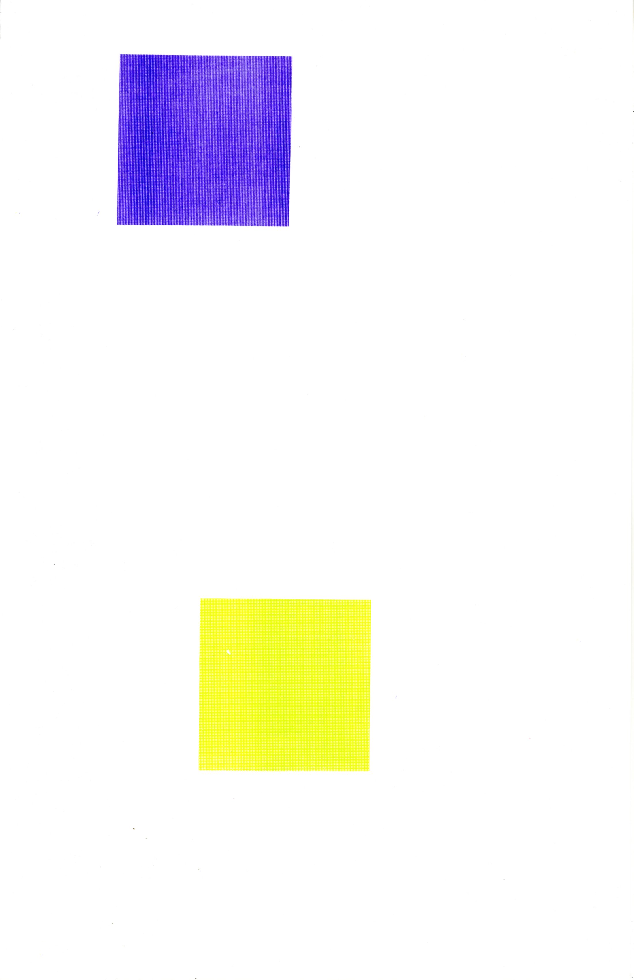
| 3/29 | 2 + 8 | Violet + Lt Lime | Again, interesting if the color/placement should help to grow or resolve... For next version, I'll start with outward (to help w printing), exceptionally random and then work inward, connecting and resolving. |
| 4/14 | 0 + 4 | Bright Red + Yellow | Had some problems with the master for Br Red, but glad it's in the picture |
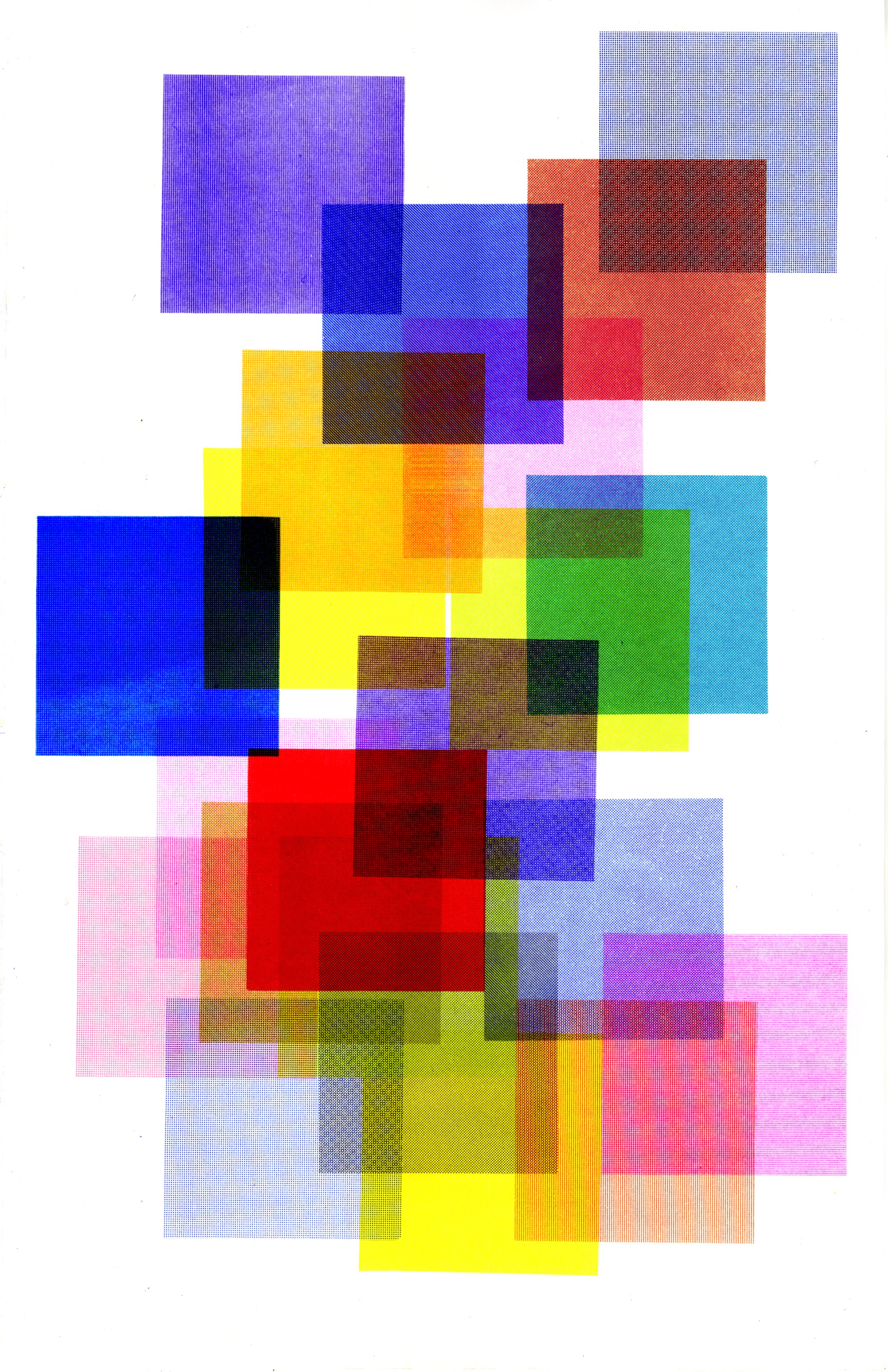
| 4/14 | 4 + 9 | Cornflower + Fl Orange | Fl Orange is another color that needs to be in a Riso print so good to see it there. Printing 2 sets in one day has caused problems though. For the next version I may need to plan and then print. |
| 4/17 | 6 + 7 | Black + Aqua | Aqua flooded - working to be ok with that as part of the randomness in this project. But a few notes for the next version - certain inks can only be so dark or they will flood (both Br Red and Aqua), try smaller or fewer squares - the open space between them is important. |